The Role UX Design Can Play in Research
Streamlining the Research Application Process of St. Lawrence College through Information Architecture and Landing Page Redesign
UX for Research
Conducting research is a daunting task that involves a comprehensive process and a wealth of information for the researcher. A part of which is applying for partnerships with educational institutions that will help in accomplishing different activities especially those involving human participants and technology. St. Lawrence College is one of these institutions that would like to contribute in the role that research plays in the development and growth of the society. The college has established the Research Services Department spearheaded by the Research Ethics Board for this purpose.
The St. Lawrence College Research Ethics Board (SLC-REB) webpage redesign is a course project aimed at improving the user experience of the existing SLC-REB webpage housed within the college website for researchers to find information on research applications and apply for a research study with the college. It streamlines the application process by a providing a more structured information architecture and effective navigation. My role was a UX researcher and designer in this project. I collaborated with my classmate Pedro Marques.
Client:
St. Lawrence College Research Ethics Board / Research Department
Project Duration:
6 weeks
Roles:
UX Researcher
UX/UI Designer
Team:
Cherry Bernardo
Pedro Marques
Discovery Meeting: Identifying the Project Goals
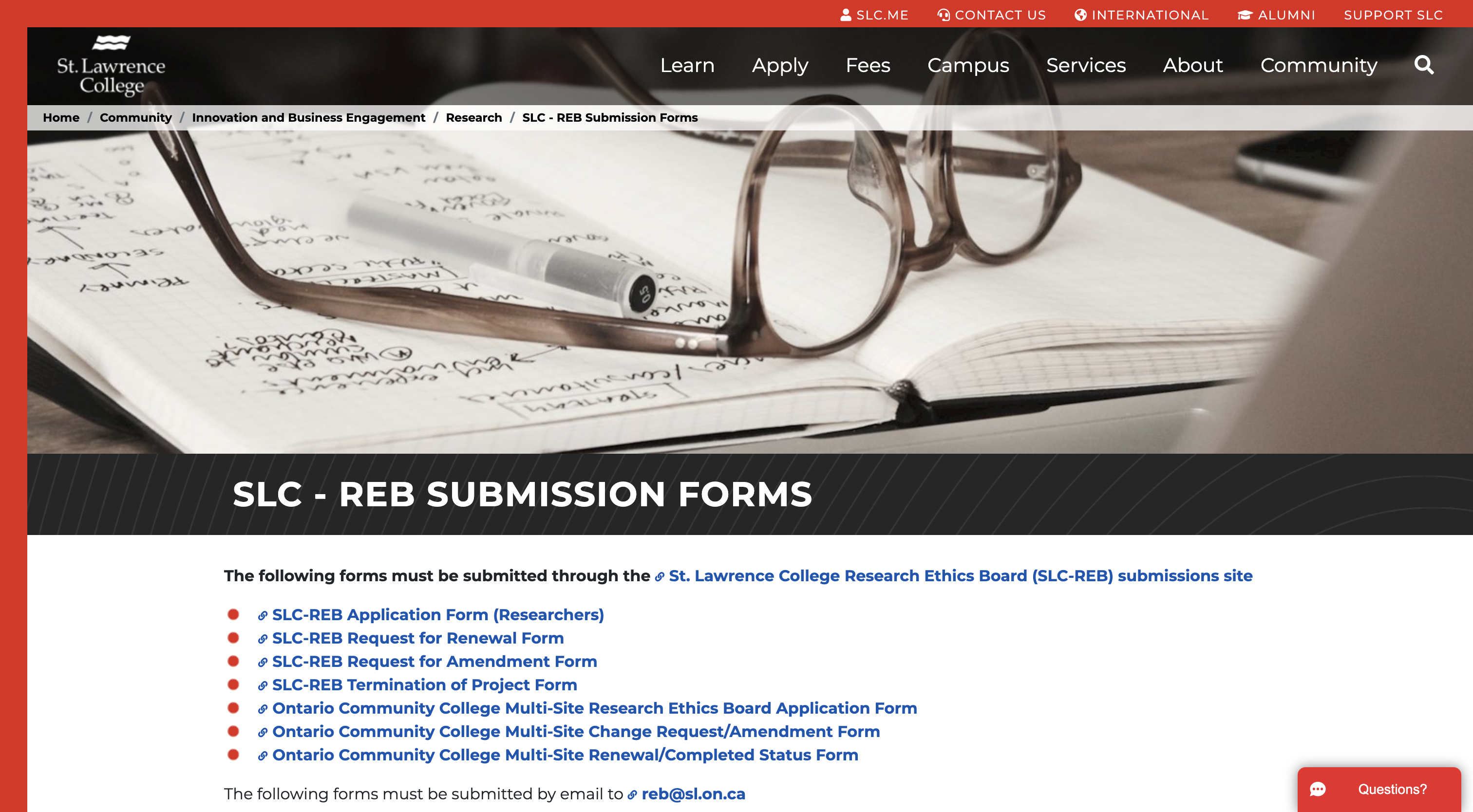
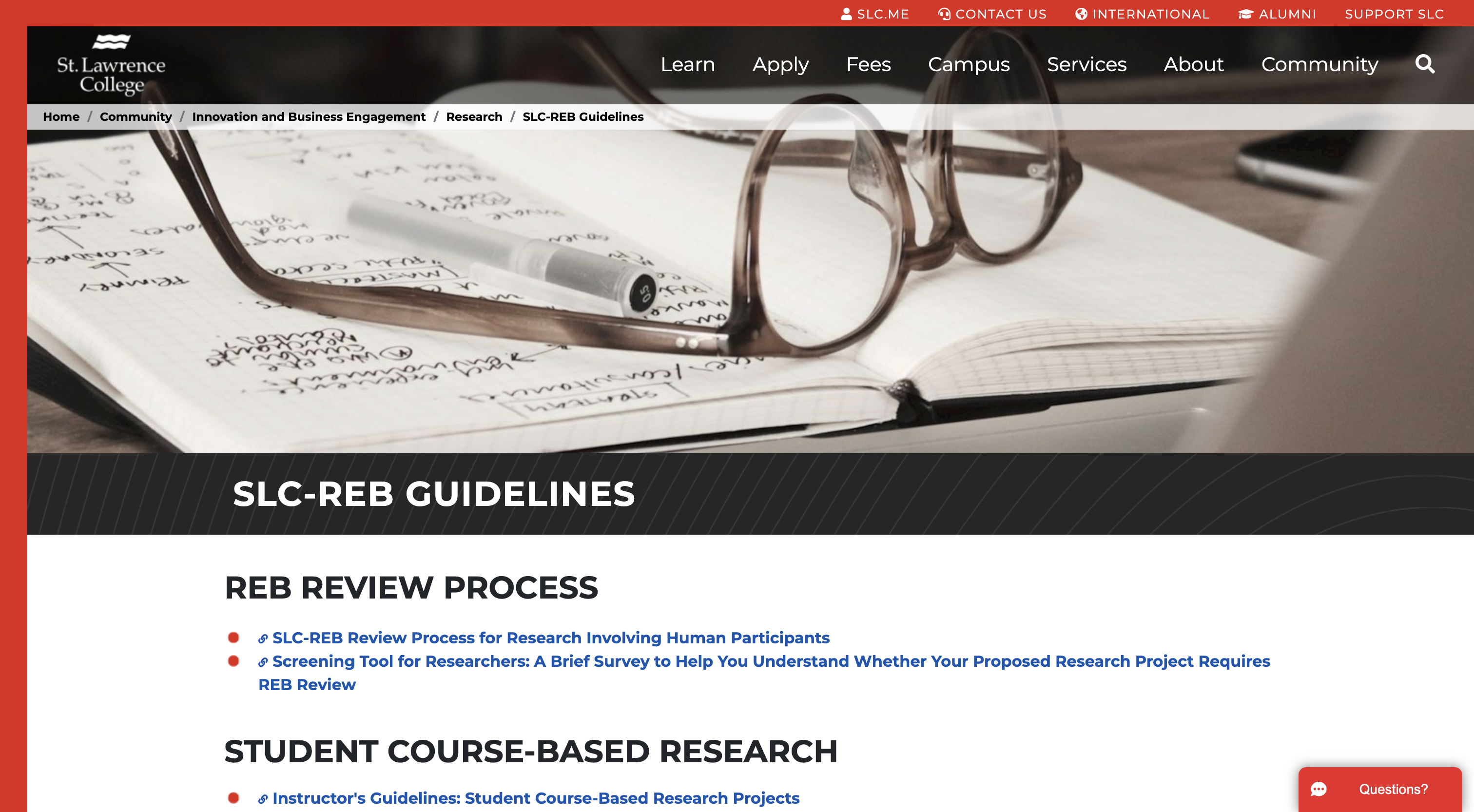
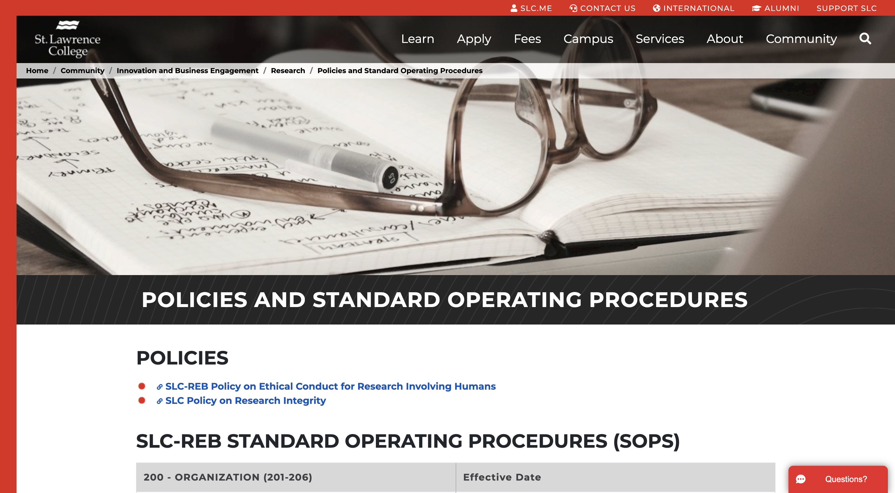
In a meeting with Robyn Saaltik, the Research Services Officer of SLC, she mentioned that the department would like to assess the usability of their website and how it can be further improved to help researchers in their applications. The current webpage for the user is an online resource for information about conducting different types of research with the college including forms, guidelines, policies and procedures established by SLC and the Canadian Government. Some of the types of research applications are submitted through a webform accessed in this webpage where they can fill-out the necessary information and upload their documents for processing. In turn, SLC through the webpage highlights and encourages research partnerships with the community to help drive business growth through research. This goes hand-in-hand with ensuring that research is done ethically especially with the inclusion of human participants.
At present, the department has been receiving multiple inquiries from users about the main concerns below. The goal of the redesign is to address these user pain points.
- Do I need a Research Ethics Board Review?
- What is the application process?
- What type of form do I need for my type of research?
- What are the documents I have to submit to apply for research?
Moreover, based from the interview and the study of the existing webpage, we identified the following user types:
- Users who would like to apply for new research and are first-time users
- Users who would like to apply for new research and have applied for research with the college before.
- Users who would like to make changes to their ongoing research.
- Users who are looking into partnering with the college for research and would like to know more about the college and current projects.

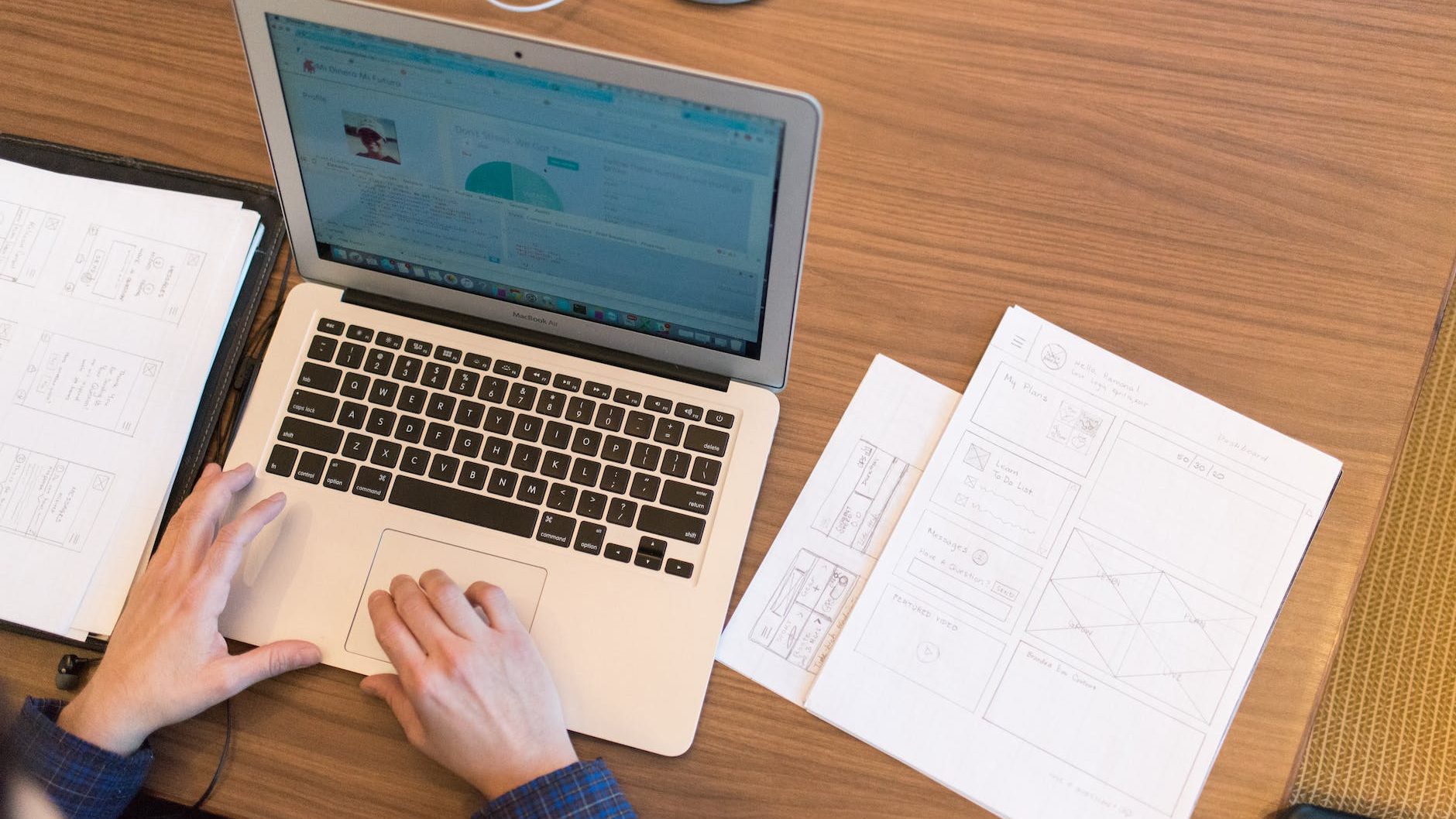
Research and Design Development through Usability Testing
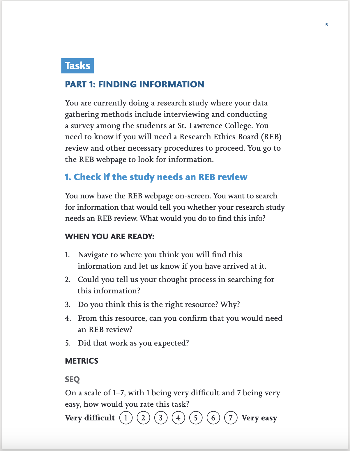
The main research activity for the project was usability testing. A first round of testing was conducted on the existing SLC-REB webpage. I drafted a testing plan that laid out the scope, type of test, target users, scenario and tasks, and the metrics that will be collected to guide the creation of the testing script. Upon testing plan approval, I ensured that our research will be done ethically by drafting an informed consent letter to be sent out during recruitment. I then worked with Pedro in creating the script to facilitate the flow of the usability testing by providing step-by-step instructions for the participants. After reviewing the script with Robyn, I recruited via email half of our participants who are SLC instructors who have applied for research before. I then facilitated and took notes of the tests both in-person and online through Microsoft Teams to assess how the participants find application-related information, and fill-out and submit forms in the webpage. Through an affinity diagram coordinated in Miro, the key findings that we have uncovered in relation to the existing webpage user experience were as follows:
- Users find value in having the webpage so that they can find information on researching with the college and contact the department for any questions they have about the process.
- Users find that there is too much information and resources to sift through in the webpage and its subpages.
- Users look for lists to start their search for information such as a table of contents.
- Users would click on the first thing that they see as relevant to the information they are looking for.
- Users thought the labels of resources are confusing because they begin with a number coding that they do not understand.
- Users found the webform has some information they need but were unsure at first if it was the right place to submit the application forms and documents because not all fields are shown unless selections were made to reveal them.

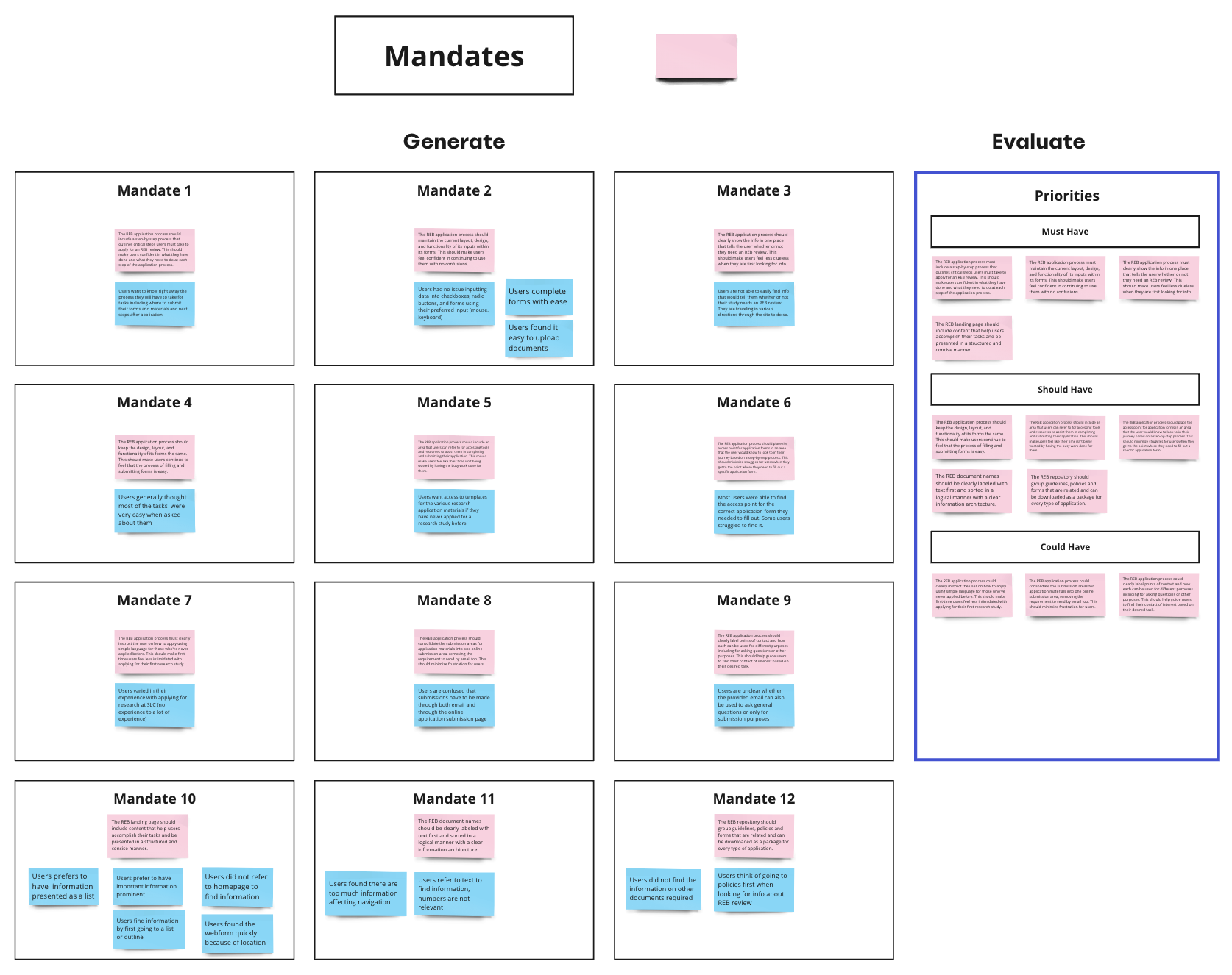
After analyzing and identifying findings and mandates from the test results using Miro, I created sketches to conceptualize the redesign of the webpage. I collaborated with Pedro in creating the overall redesign concept translated into an initial interactive prototype in Figma. Specifically, I worked on the homepage and submit application page. This prototype was used in a second round of testing to check if the redesign works in favour of the users. Our main design mandates were:
- The homepage will serve as a marketing tool and lead users to a application resources page or the submission page so that the different types of users can be directed to what type of information they are looking for.
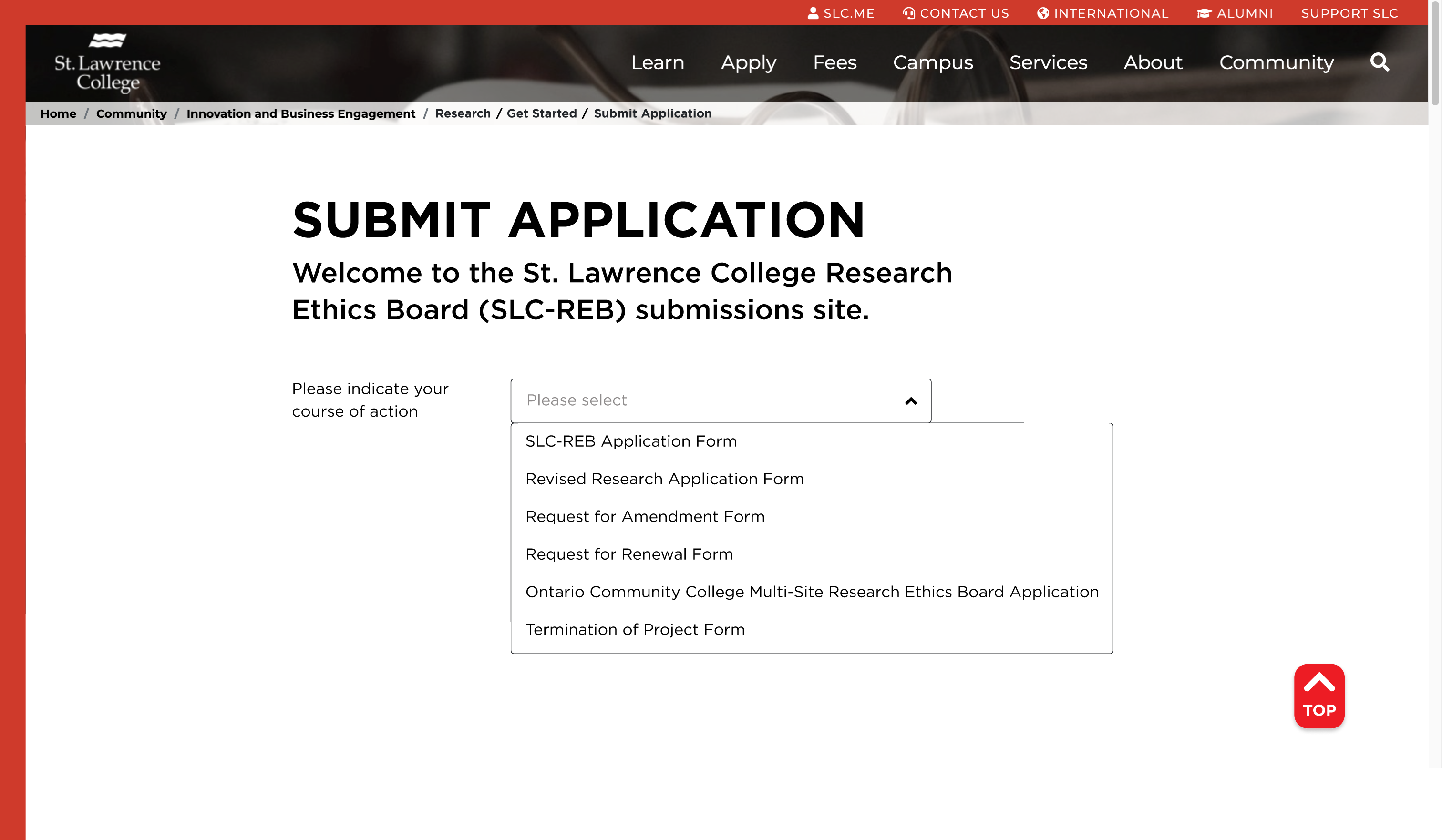
- An application page should be created where users will be able to find the information and resources they need for research. These information and resources must be structured and organized so that users are able to find everything they need in one place.
- The submission page should be clear and show all the fields needed to be completed according to the type of application so that users know that they are in the right submission area.
- Maintain and follow the current SLC branding so that users are aware and confident that they are in contact with the college.


Once the prototype was finished, we began recruitment for the second round of testing. I recruited half of our participants via email and we were able to schedule more in-person testing for this round. Just like the first round, we alternately facilitated and took notes during the tests. We analyzed our data through an affinity diagram in Miro and came up with the following key findings:
- Users found the Homepage with the simple statements and corresponding buttons as one of their favourites because of the clear language employed that directed them right away to what task they would like to do.
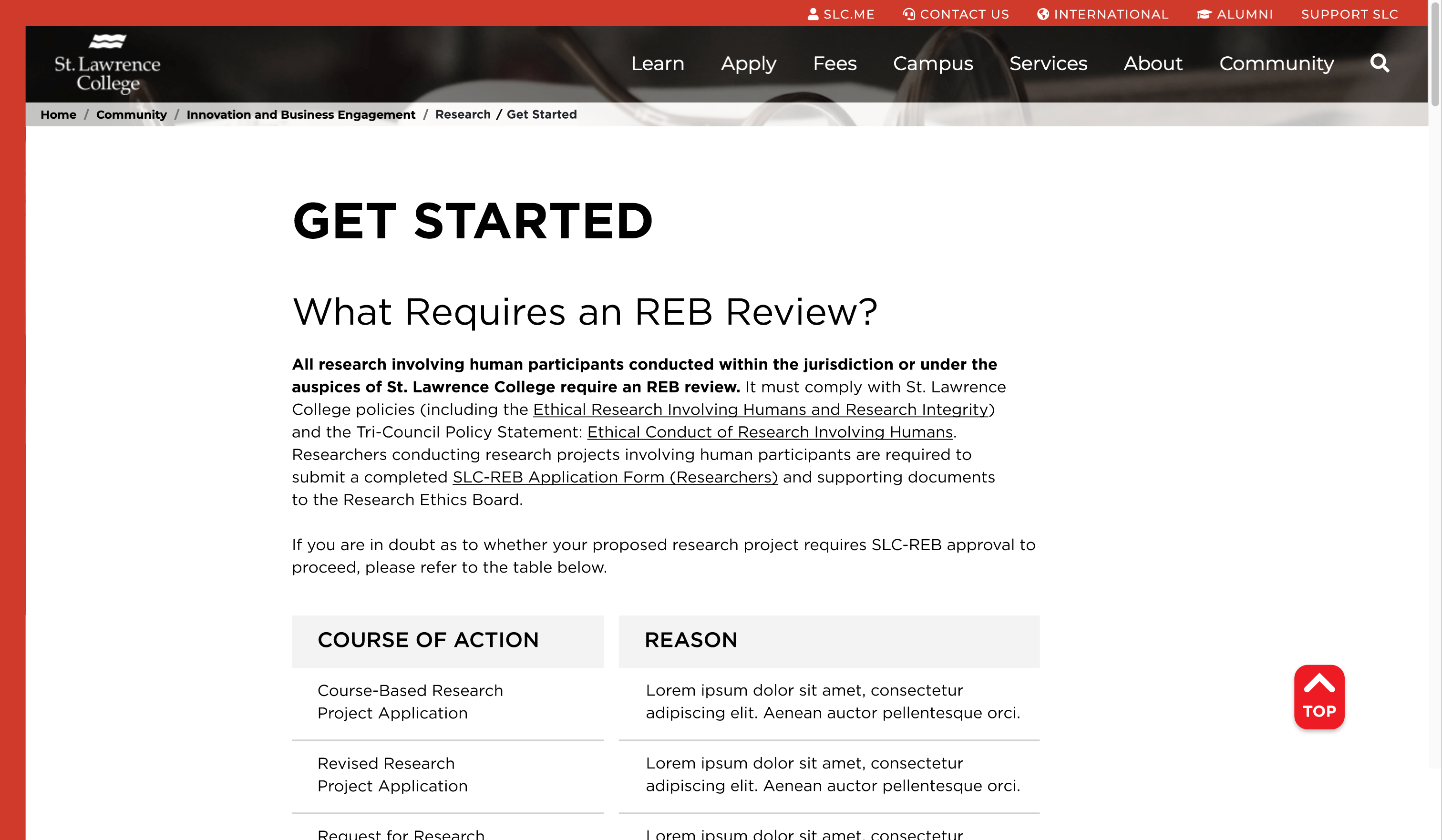
- Users were able to determine if they needed an REB review because it was the first information they saw in the Get Started page.
- Users found it helpful that the information and resources needed per type of application were grouped together in the Get Started page.
- Users accomplished their tasks successfully in the submit application page and were aware that it was the right submission area.
- Users were uncertain on the type of research to refer to because they were looking for the heading “Internal Researcher” that they believed is what the user testing scenario is asking for.
- Users found the Get Started page to be very long and were looking for a clear outline of the research steps they must take.
Form these key findings, we began to edit the prototype that will be presented and submitted to the client based on the following design mandates:
- The Homepage and Submit Application page designs are to be retained.
- Create a clear step-by-step instructions for the user for them to know how to navigate through the Get Started page.
- Add the “Internal Researcher” section to current type of applications.
- Further improve the information architecture and organization of the types of applications in the Get Started page to direct the different users to their corresponding section.
Given that the pages I previously worked on were effective based on user testing and only needed rechecking, I created the step-by-step instructions and helped in organizing the types of applications and improving other content in the Get Started page.
We presented the final prototype to the client together with our research study findings through an online Teams meeting with Robyn and her team. They were delighted with the amount and the quality of work we were able to produce in a short period of time considering all the other projects we were working on simultaneously individually and with other groups.
Project Insights: How the User Finds Information
From the findings in the usability testing, it was evident for all participants that simplifying communications is important. Their first go-to when finding information is to refer to a list such as a table of contents. Another insight is that not everyone would scroll down a landing page, if they see something in the upper fold that they think would already direct them to what they need, they will go ahead and click on it. From this, it is important to already have helpful information on the very first screen users see that may already show what they need or direct them to where they need to go. In the end, these findings all point to how convenience is key to make a user’s journey as effective and comfortable as possible.
Challenges and Wins
There were two main challenges during this project. The first is in the recruitment of testing participants where finding a common time for both our team and the participants within a given time frame was not easy to arrive to. It was important to plan ahead in scheduling to ensure that we are able to conduct them in a timely manner. The second challenge was conducting the usability testing online. A majority of our participants preferred to do it online rather than in-person. As such, there was more preparation needed for online testing to ensure that the participants are able to setup the test on their end by themselves. We were able to achieve this by sending them a pre-test email that explained how the process will be and what they need to have on hand while doing the test. Moreover, as a notetaker, it was difficult to look at both the participants and their screen at the same time to capture all the needed data. To address this, we gave the participants the option to think aloud as they went ahead to accomplish their tasks or we asked additional follow-up questions if they did not wish to think aloud.
Despite these challenges, I enjoyed the usability testing. It was interesting to witness how the participants went about their tasks and discovering how there are more commonalities than differences in the way they think. I was also grateful to one of our participants who praised how I facilitated the usability test in a professional manner compared to others she experience before. They mentioned I was prepared and organized, and provided a comfortable experience for them.
Information Architecture’s Role in Research Success
Hindering research means pressing pause in solving society’s problems and in discovering new frontiers for human development and progress. Therefore, processes and tools that support and make research possible must be made efficient and effective. As simple as improving the findability of research application information would prove to be one of the building blocks for successful research. Having been able to help in this aspect through our webpage redesign of the SLC-REB makes our work as UX researchers and designers a fulfilling and productive one.
